Precision Meets Excellence – A Global Identity Reimagined
Background
Opruss is a global leader in high-precision optical and quantum measurement instruments. Known for its scientific rigor and technical consistency, the brand already had a strong logo, product ecosystem, and communication in place. However, as the company expanded globally—especially into U.S. and Asian markets—it needed a brand evolution that would subtly enhance its identity without disturbing its core.
Challenge
The brand faced a subtle but critical challenge: While Opruss communicated precision and trust, it lacked a cohesive digital experience and emotive tone that aligned with its global ambition. The internal brand positioning needed refinement, and its existing color language didn’t reflect the innovation and energy the company stands for today.
Our Work
We partnered with Opruss to define and deliver a complete digital brand experience that retained its legacy while adding vibrance and clarity.
Mind Mapping & UX Strategy: We began by deeply understanding Opruss’s users—from scientists and researchers to global procurement heads—and mapped their journey across the website.
Website UI/UX & Development: The outcome was a modern, intuitive, and globally appealing interface that enhanced content accessibility while communicating high-tech authority.
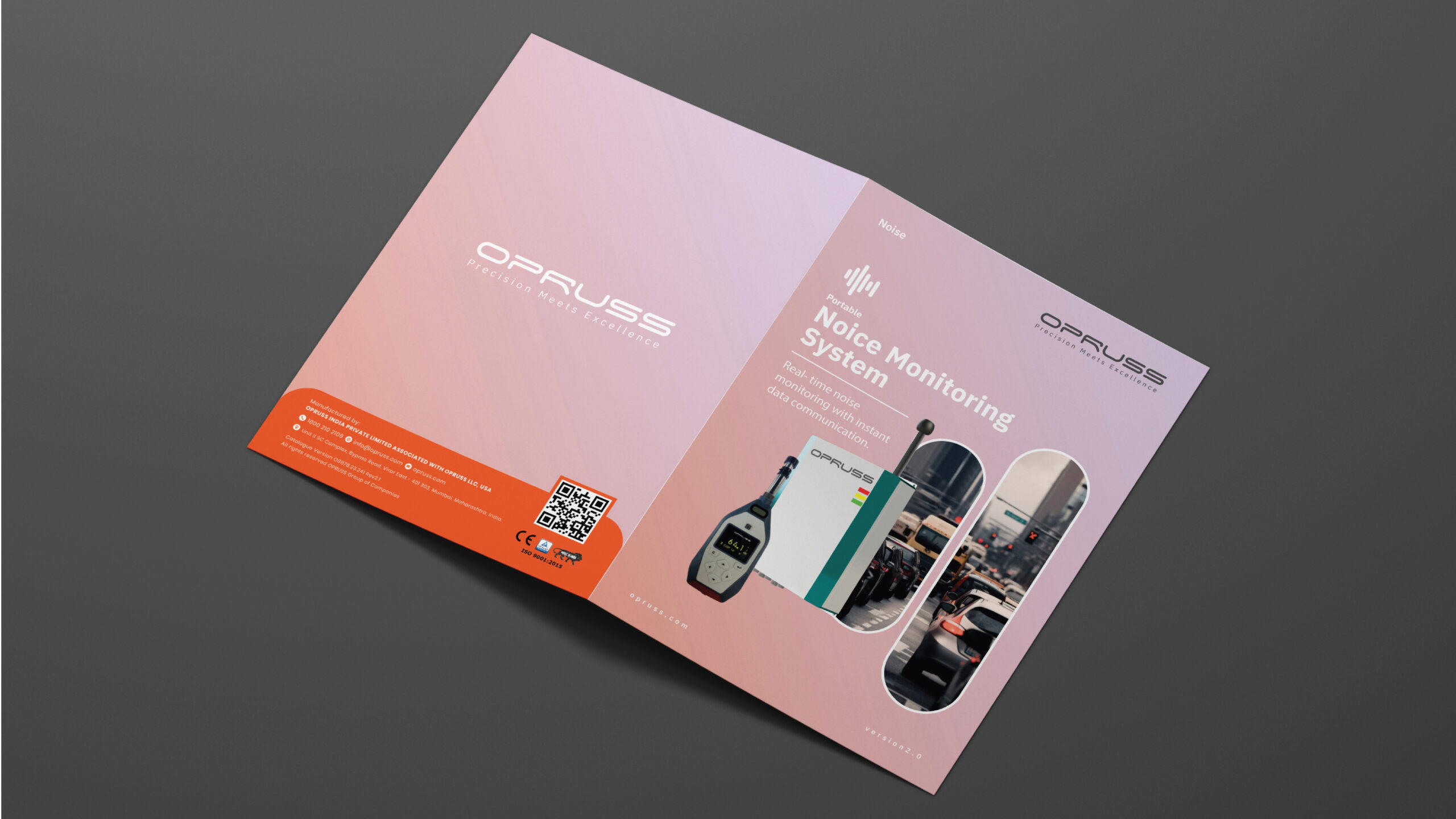
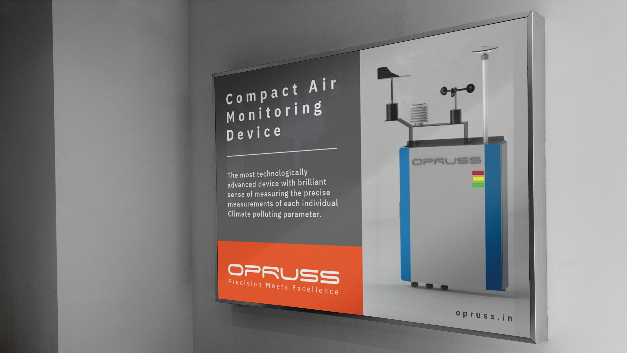
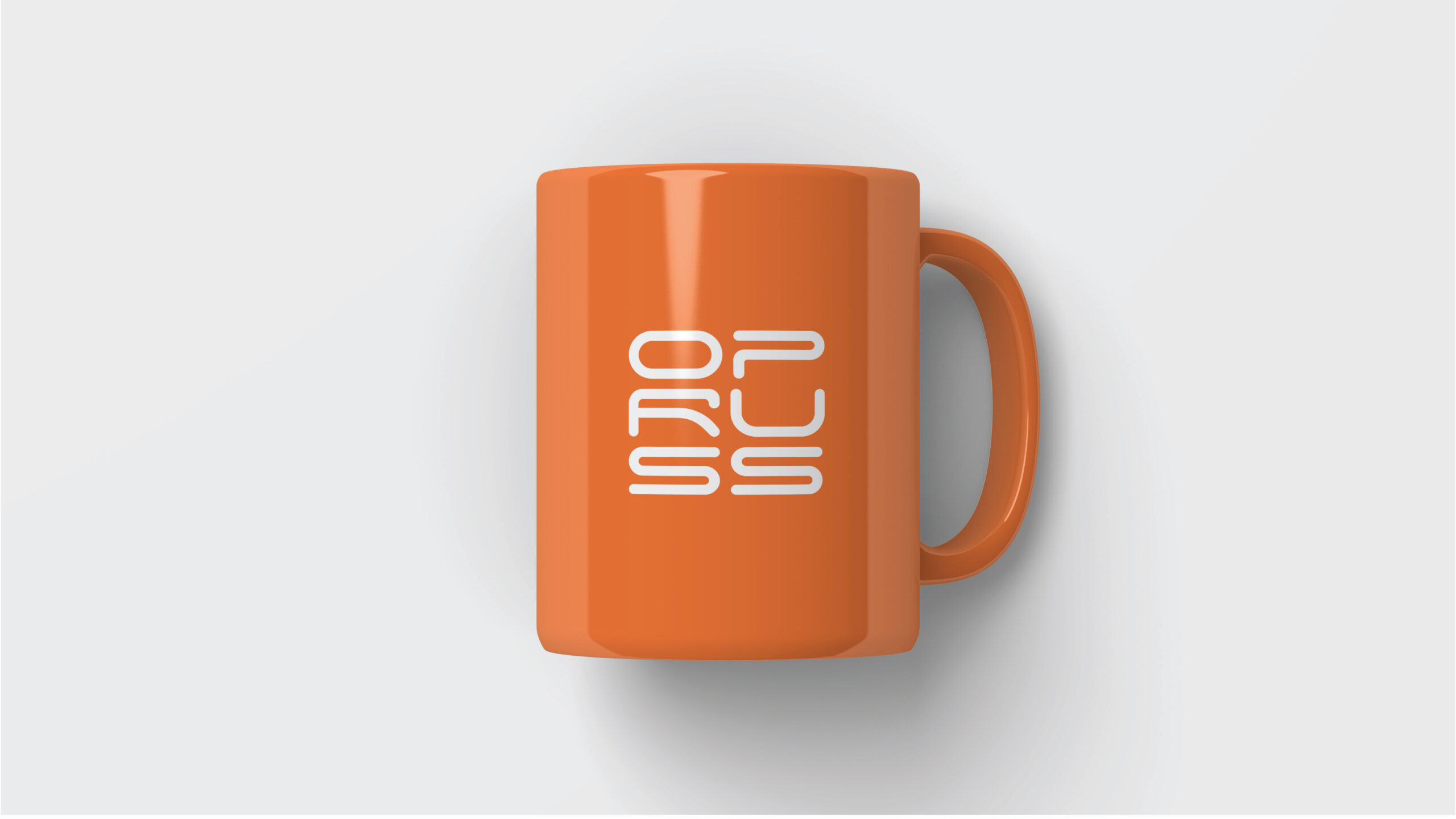
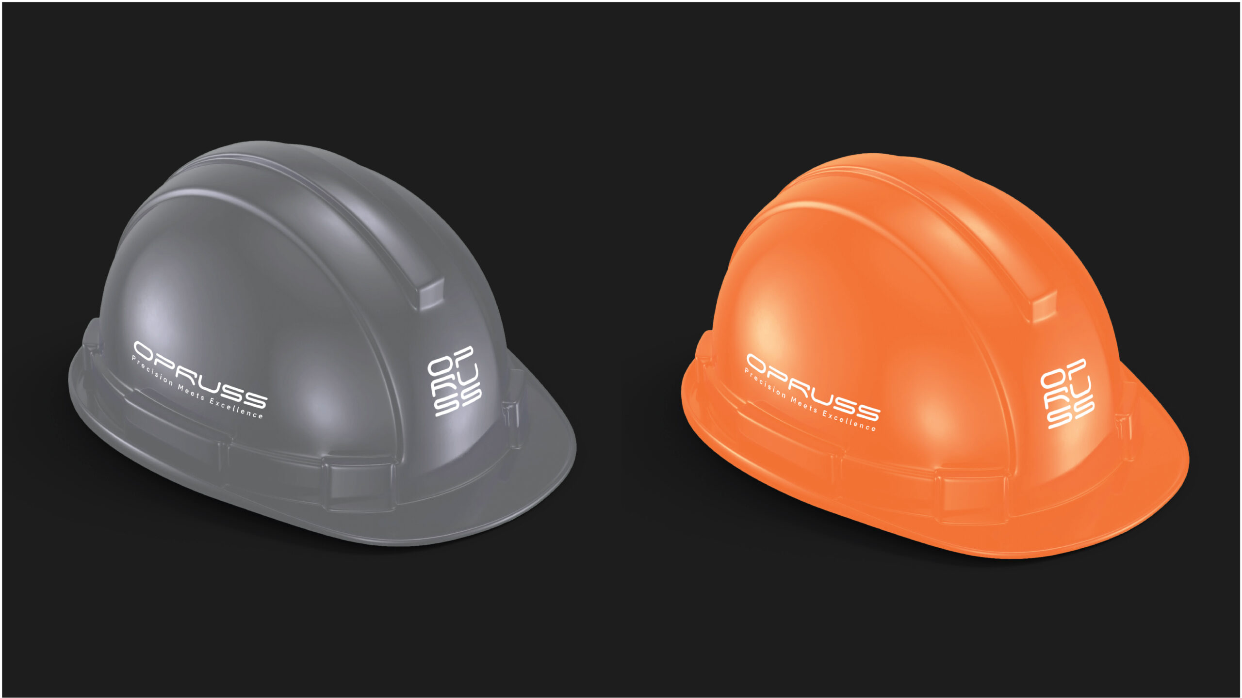
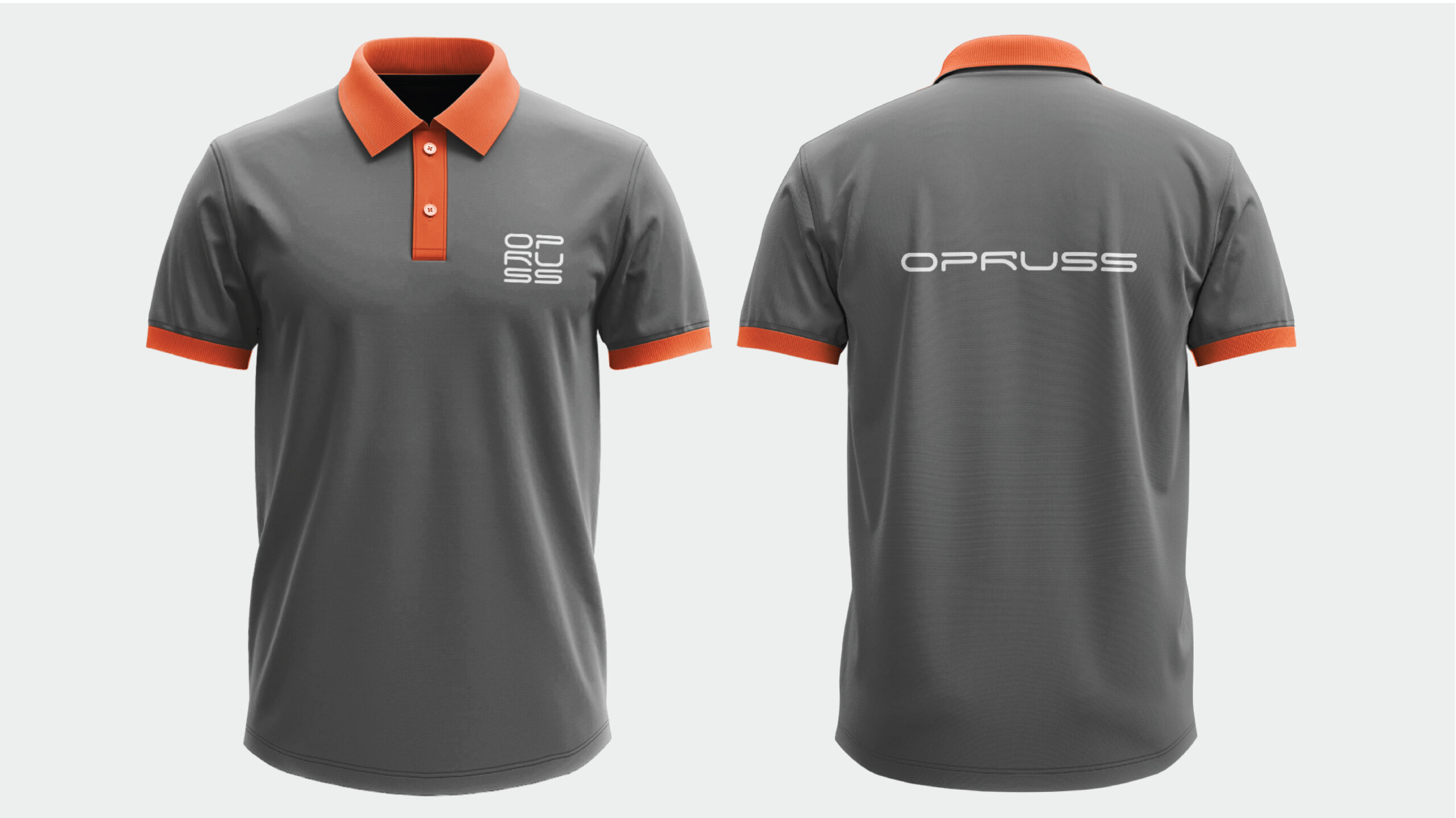
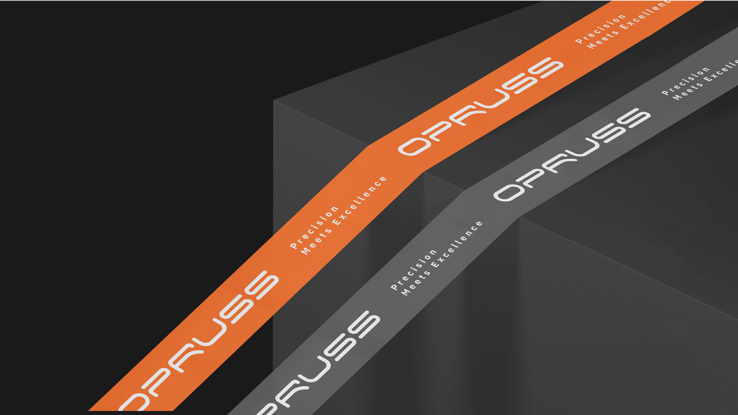
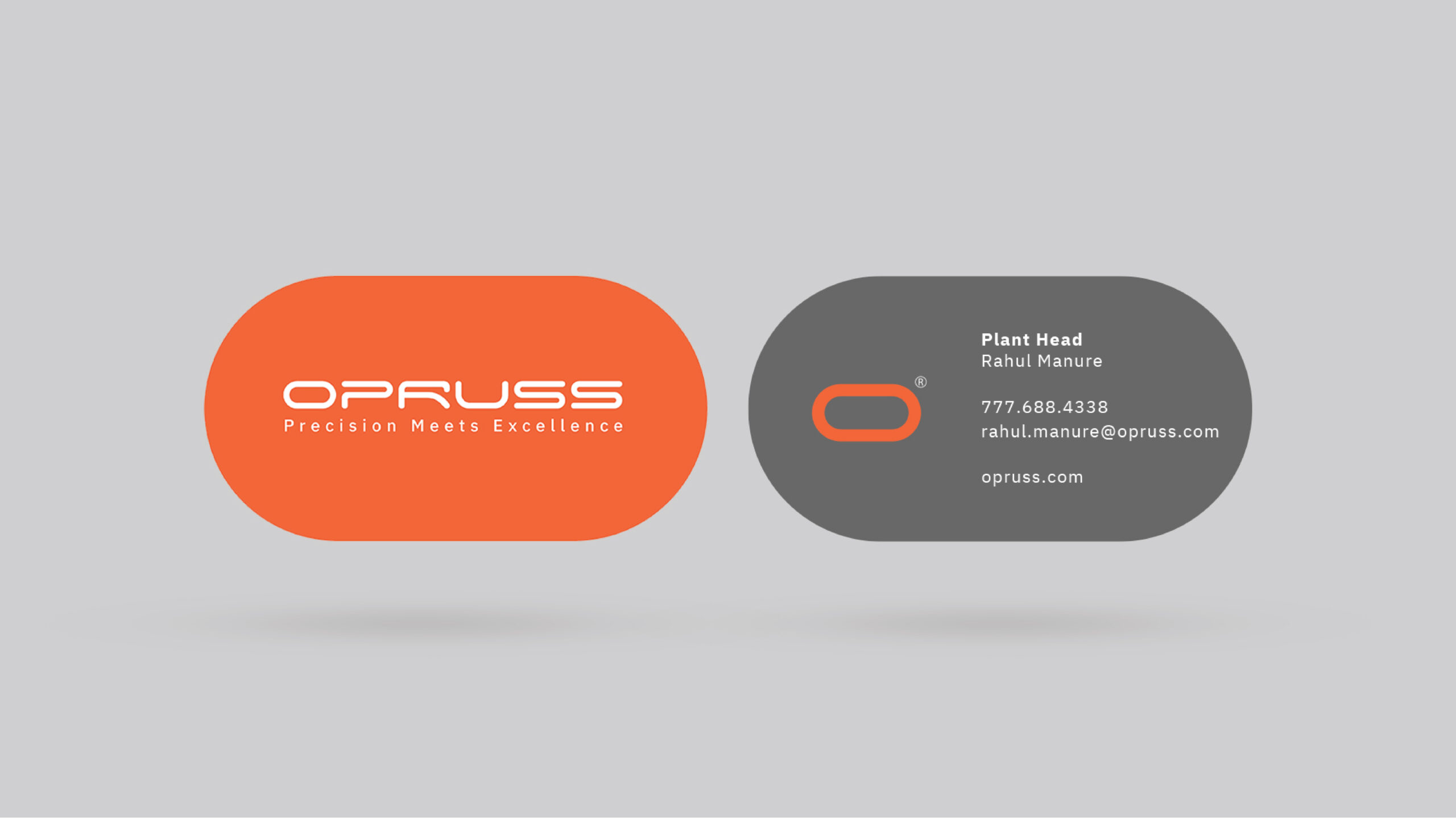
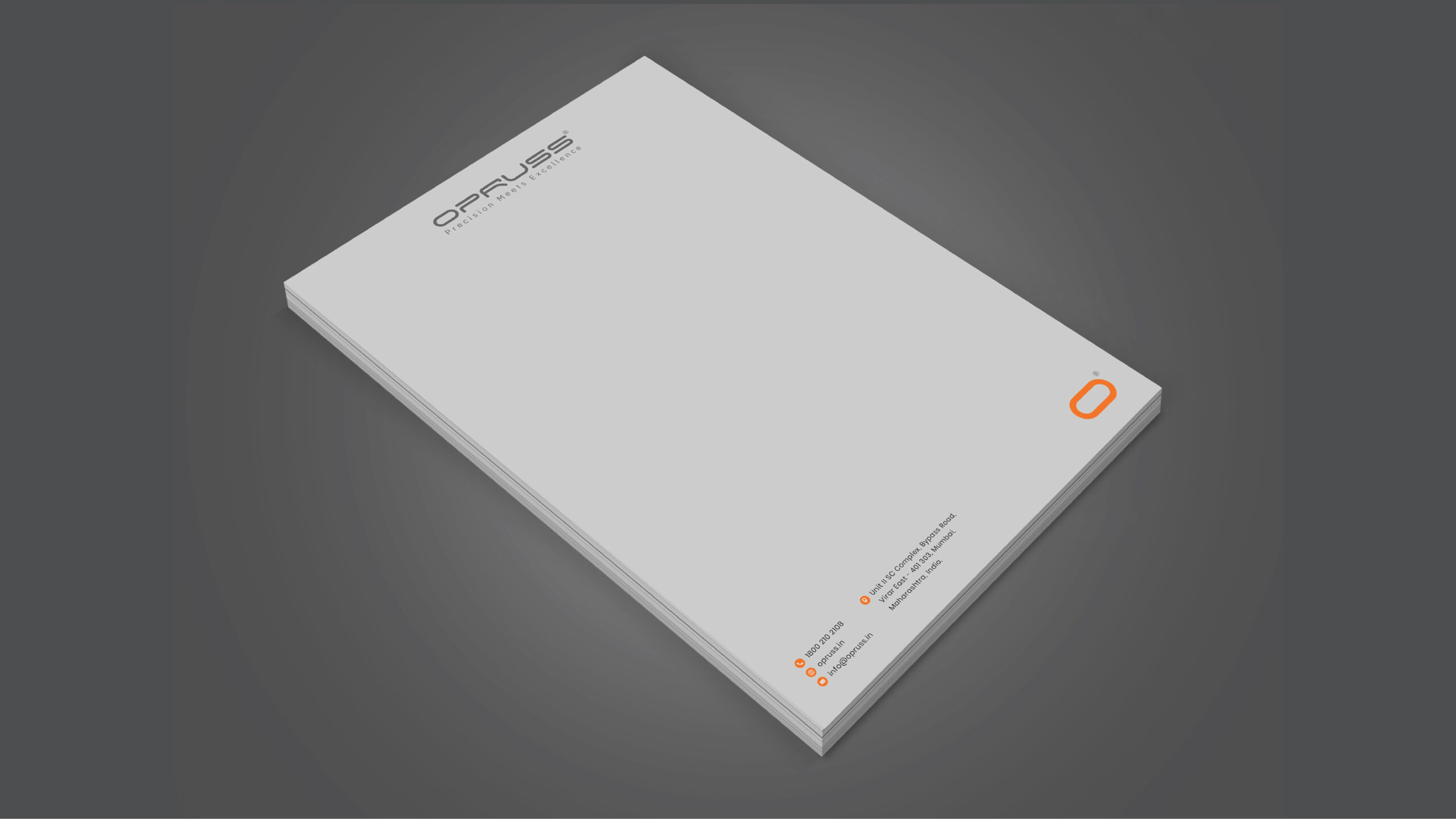
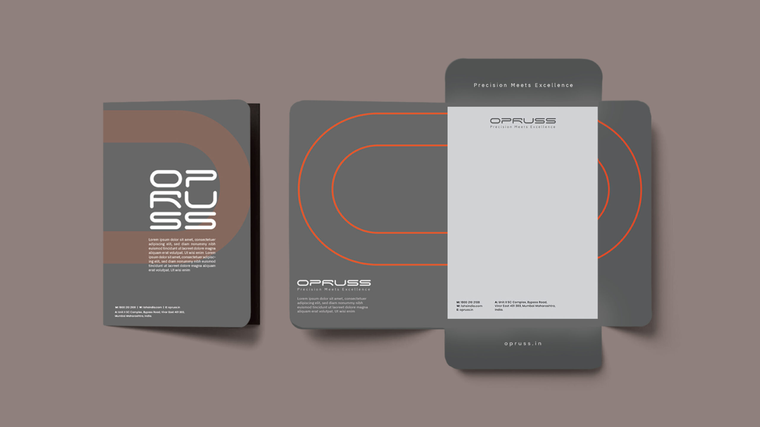
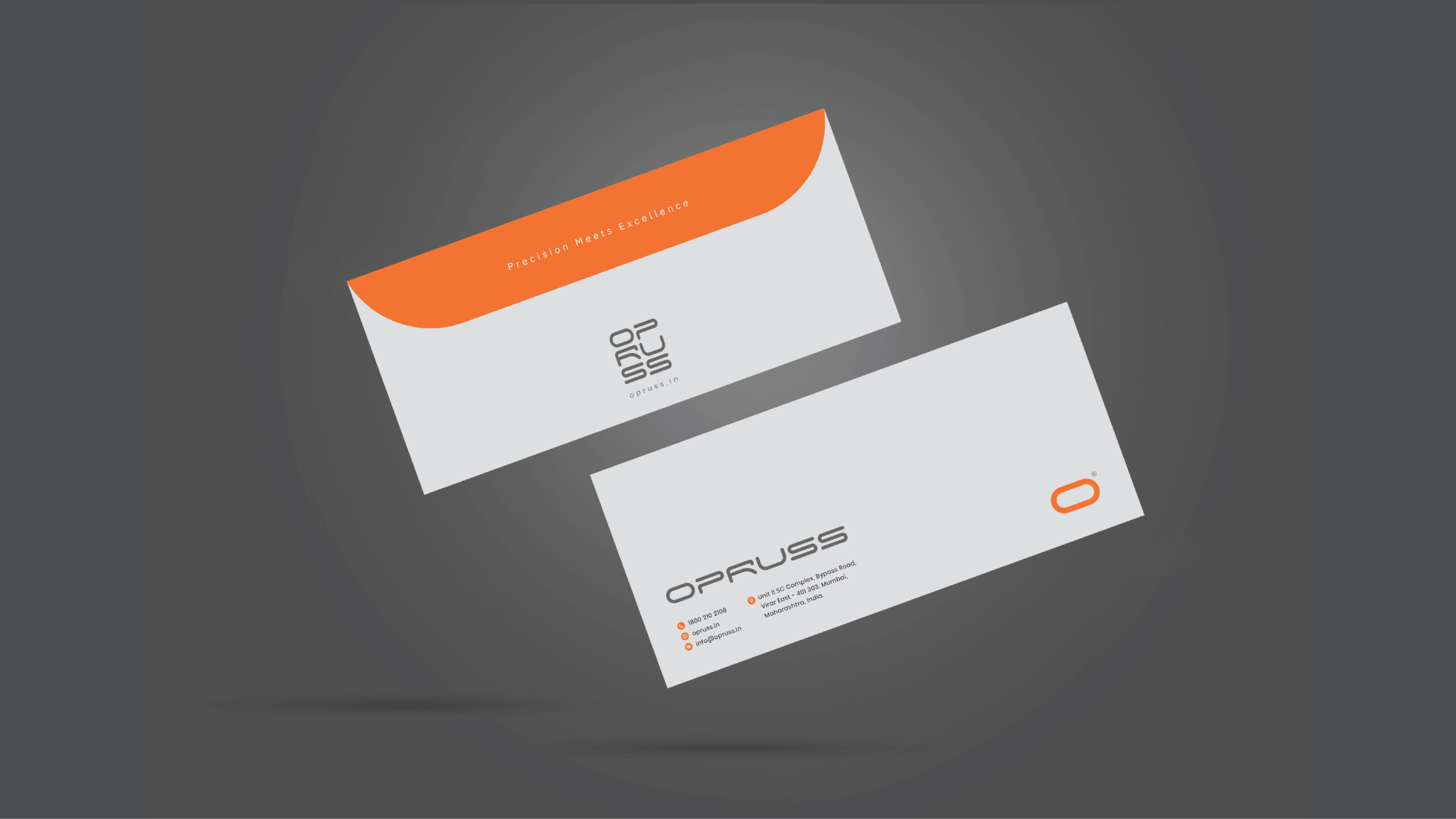
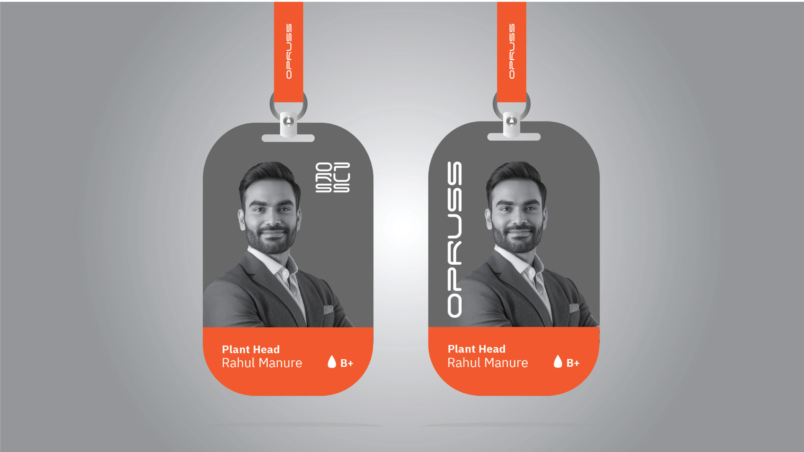
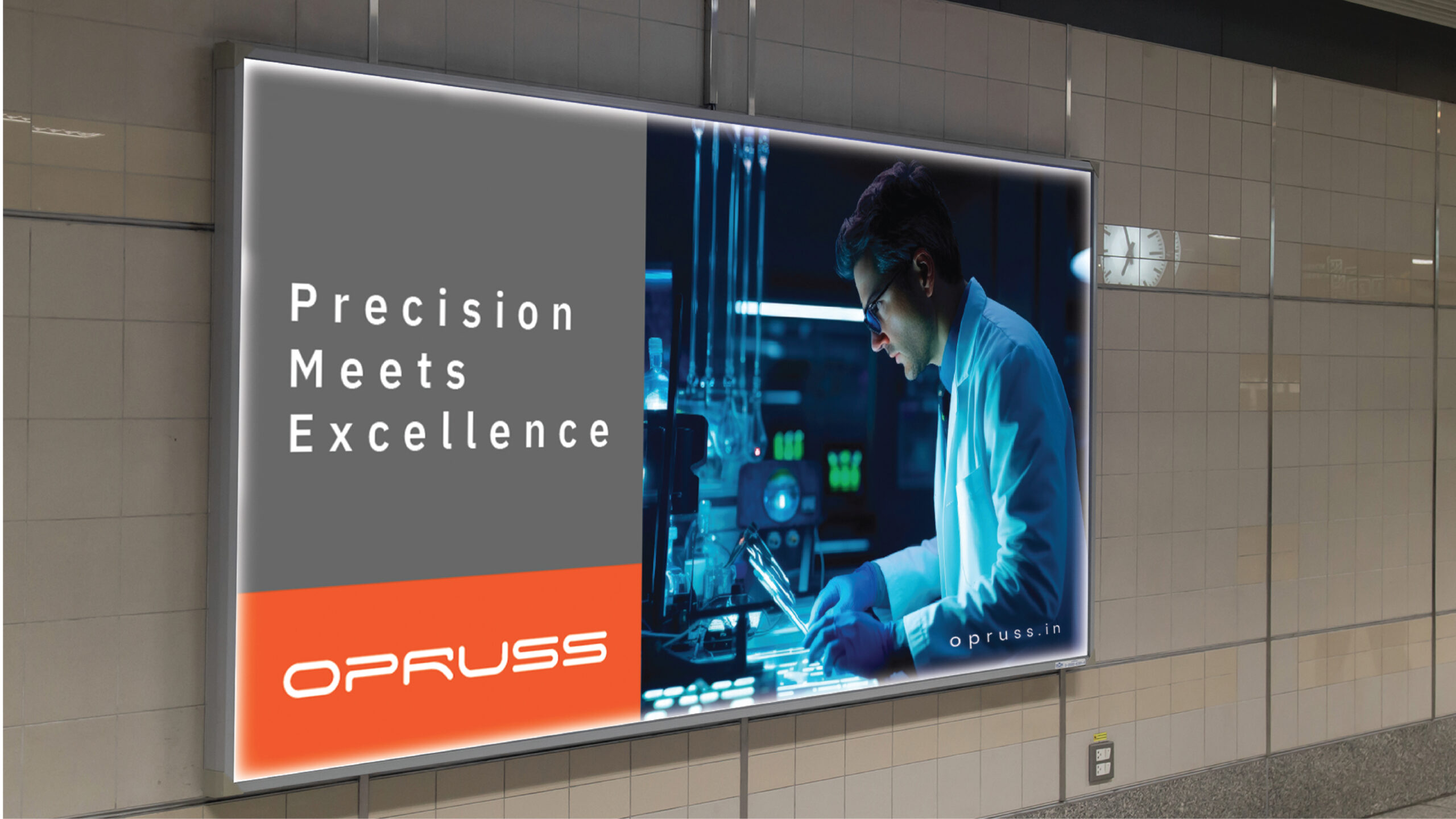
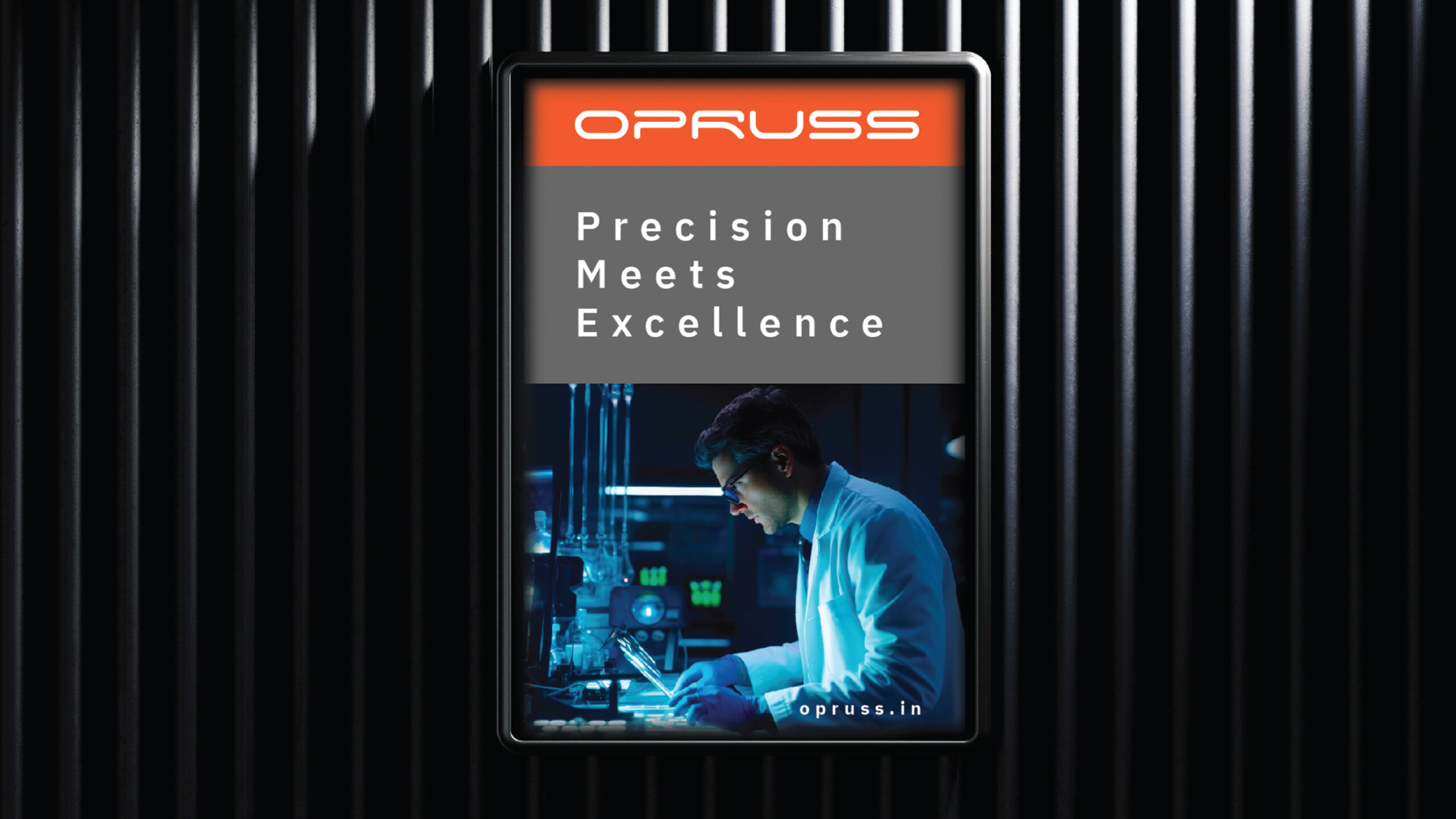
Color Strategy – Vibrancy Within Precision: We introduced a fresh orange accent into the existing grey palette. This small but strategic change added life, clarity, and a sense of momentum across key touchpoints like buttons, hover states, and highlights—bringing energy without losing the brand’s scientific seriousness.
Result
A digitally aligned and globally-ready identity that truly reflects Opruss’s positioning— “Precision Meets Excellence.”
The redefined visual language and user experience now speak confidently to an international audience, offering both authority and approachability.