The Challenge
The brand identity for LAHS had a serious disconnect.
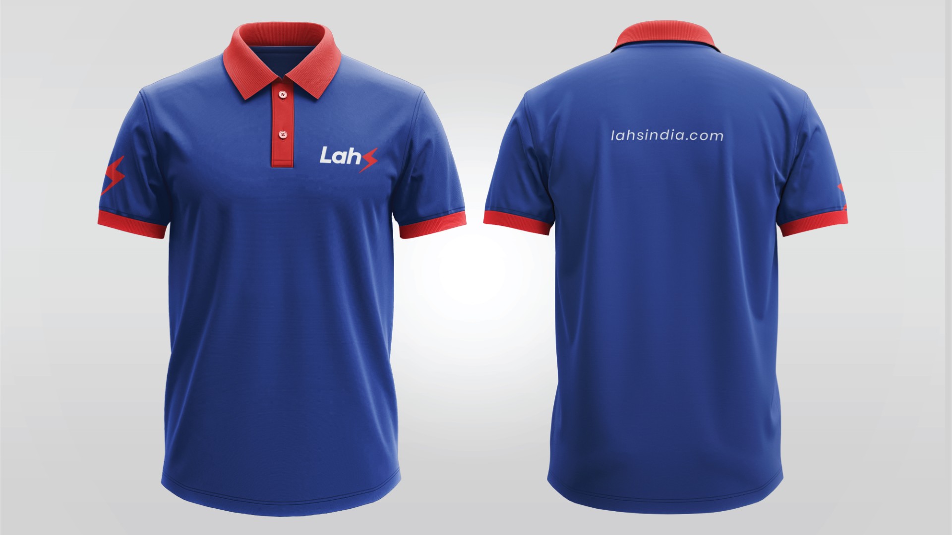
Their previous logo tried to merge the ‘S’ in LAHS with an electrical symbol—but ended up losing the clarity of pronunciation and visual coherence.
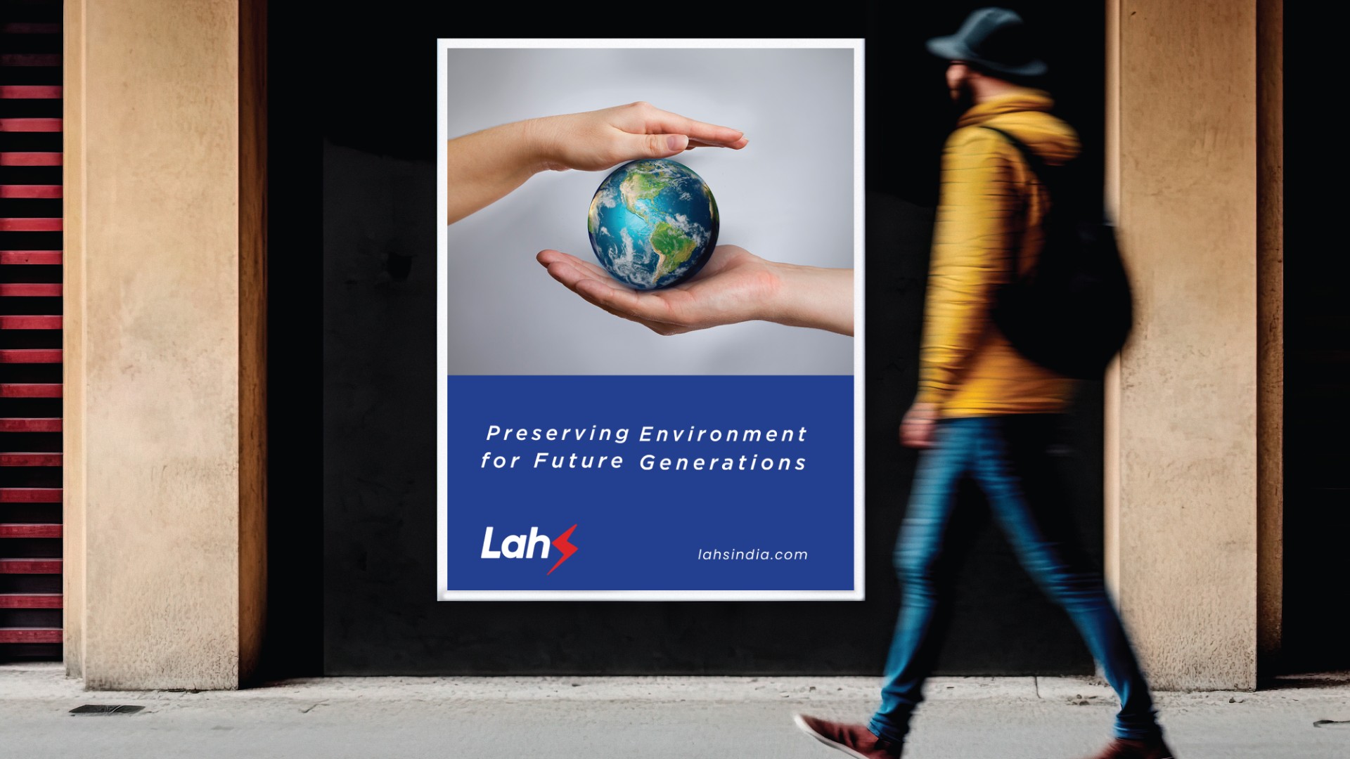
At the same time, their website and brand language didn’t reflect their pioneering work in zero dumping, composting, and waste treatment solutions.
They had the vision, the tech, the impact—but not the recognition they deserved.
Our Strategic Intervention
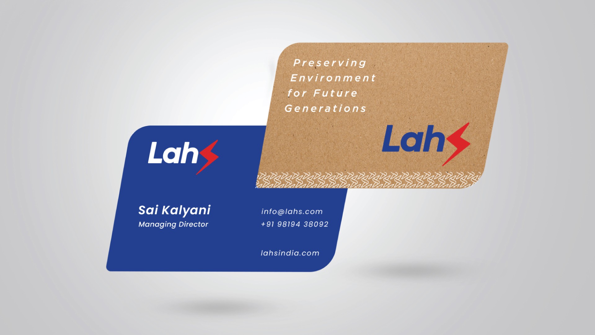
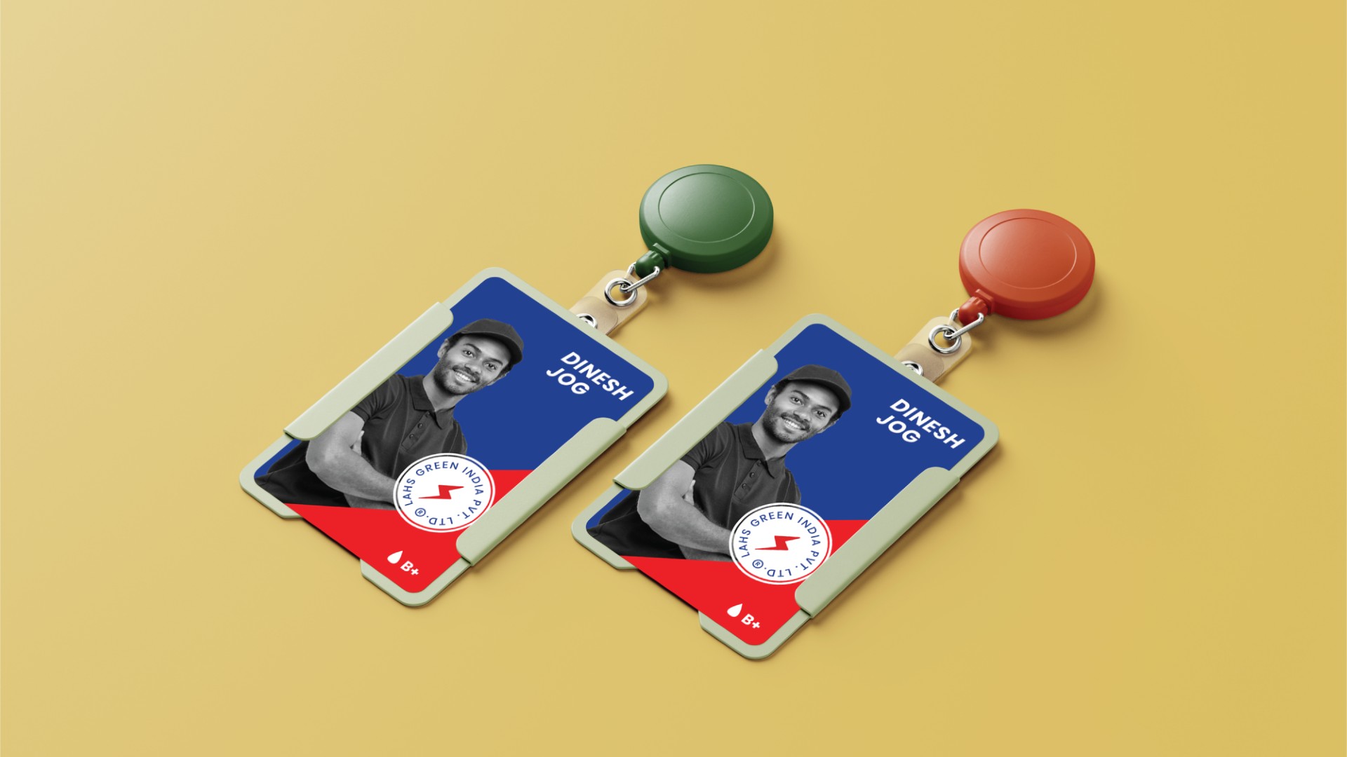
- Logo Rebranding
- We diagnosed the core issue: S in the logo wasn’t legible, leading to brand confusion.
- The solution: we separated the ‘S’ as an independent symbol, drawing from its original energy motif.
- Created a clean wordmark for ‘LAHS’ that was strong, readable, and future-ready.
- This shift became the first step from brand confusion to brand loyalty.
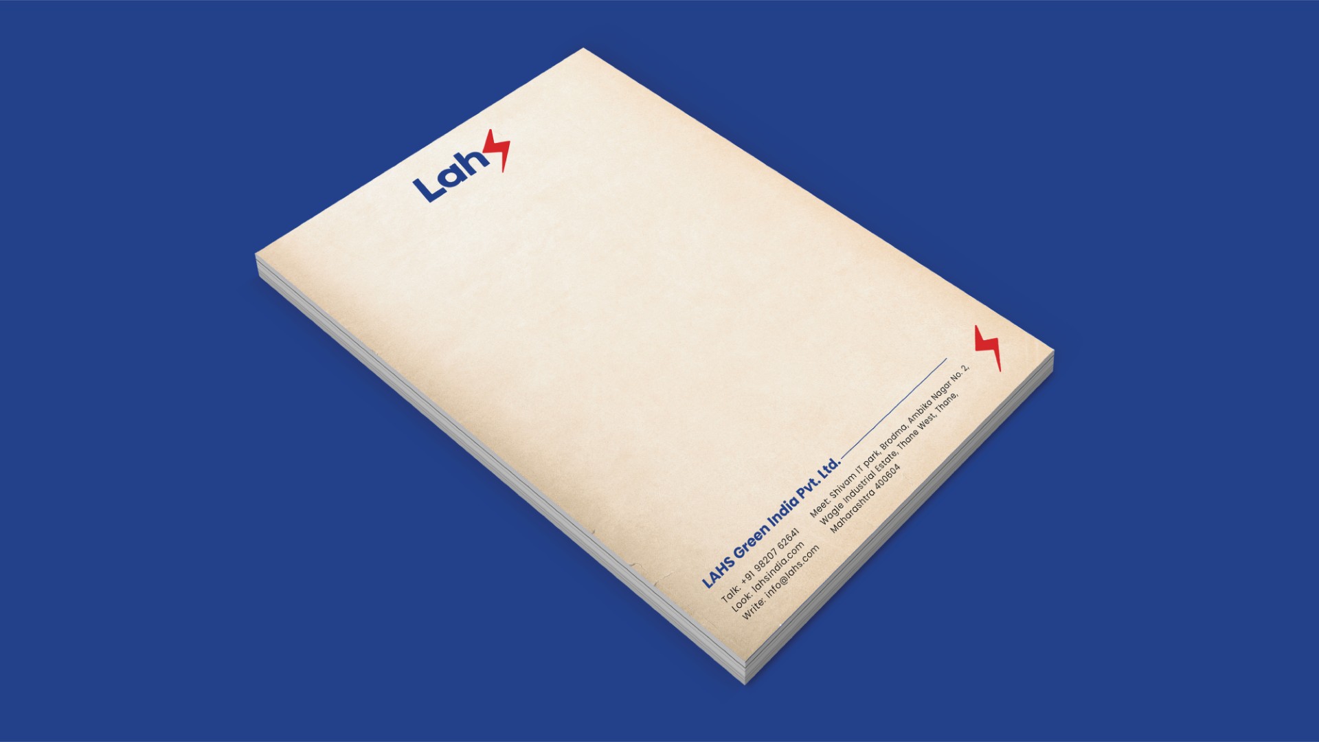
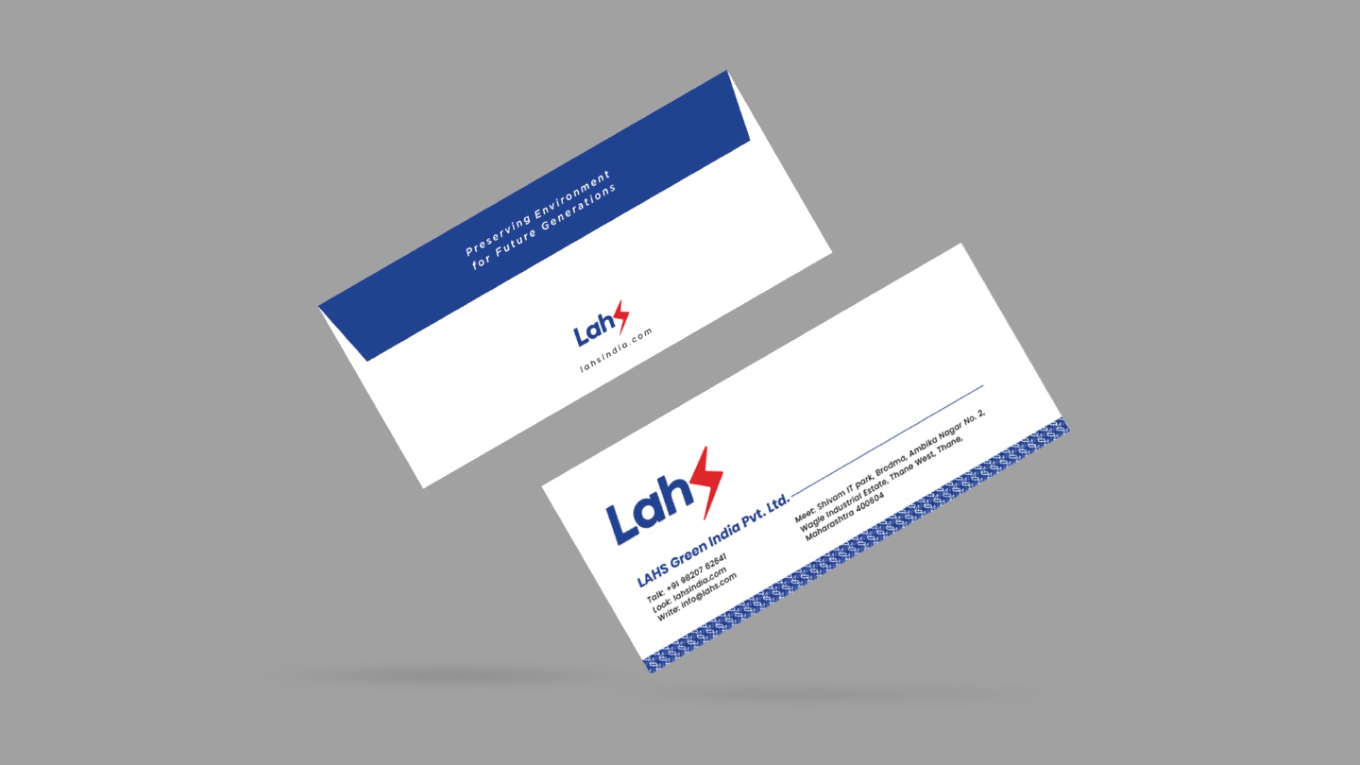
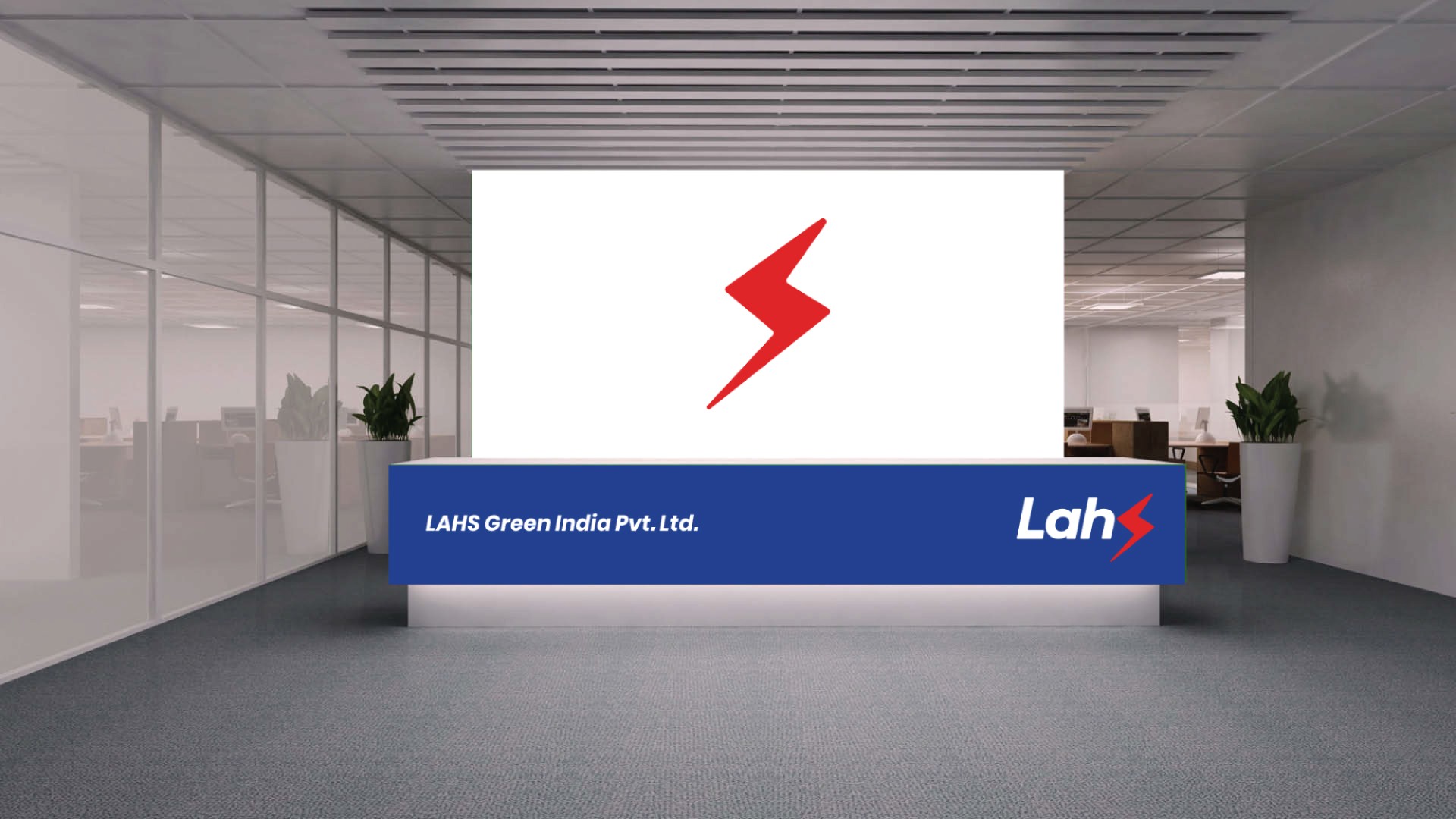
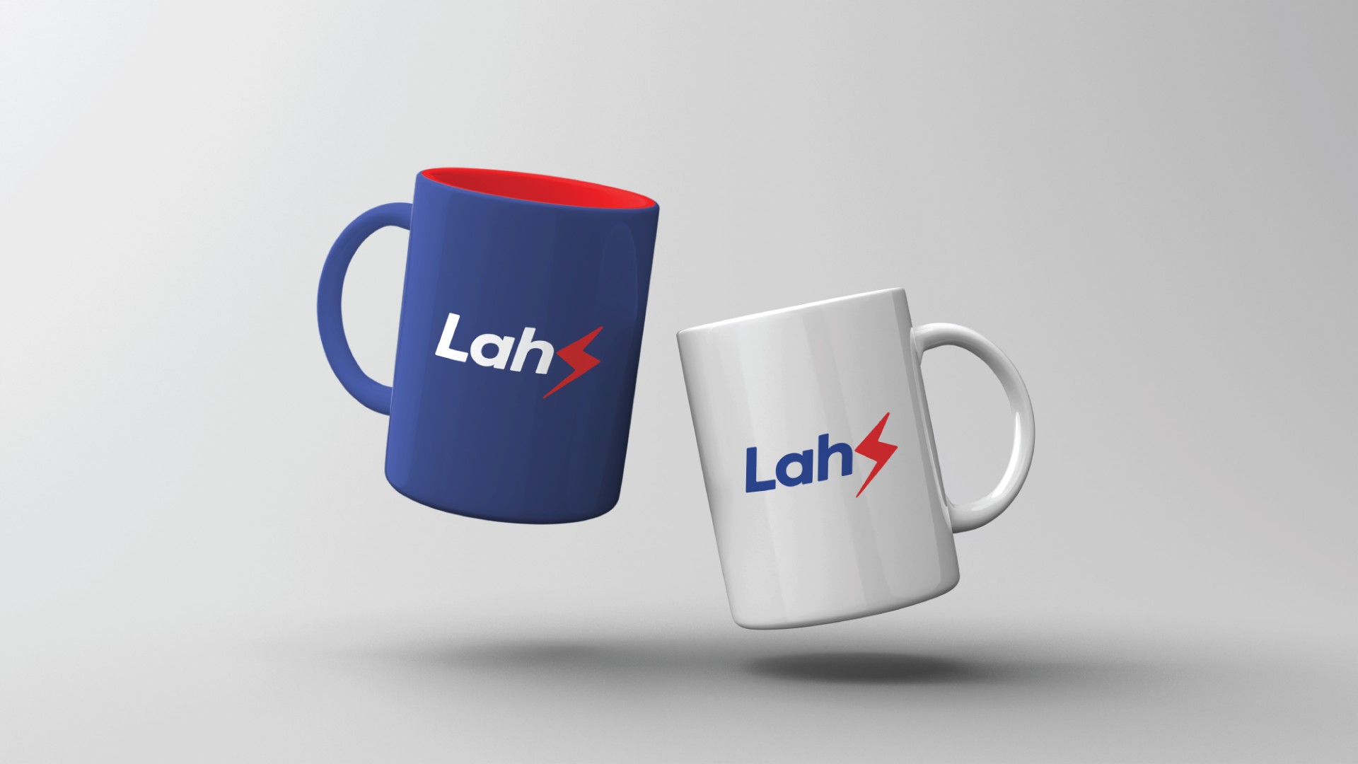
- Visual Identity System
- Developed a consistent design system across brochures, presentations, and packaging.
- Standardized the brand elements for all sub-solutions like Goldust, Prabhas, SCWC, etc.
- Website Revamp
- Reimagined their entire website as a solution-first platform, not just a product showcase.
- Enhanced UX/UI for faster navigation across their diverse services.
- Created a mobile-optimized, SEO-ready interface to elevate visibility.
- Result: Explore mock here
Impact
What started as a logo problem ended in a brand revolution.
LAHS now speaks louder, looks sharper, and earns the attention it long deserved.