Challenge
The challenge was to build a sensitive, trustworthy, and progressive identity around topics often considered taboo or uncomfortable—like infertility, sexual stamina, and hormonal imbalance.
Additionally, the name AyuCareX, with its sharp ‘X’ ending, risked sounding like a synthetic pharma product. We had to ensure that it remained rooted in Ayurveda, while also signaling modern confidence, discretion, and scientific backing.
Solution
We designed a brand identity that is both bold and botanical.
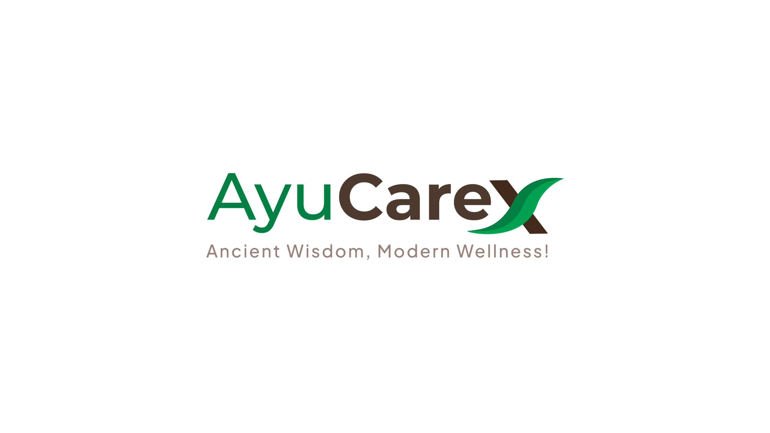
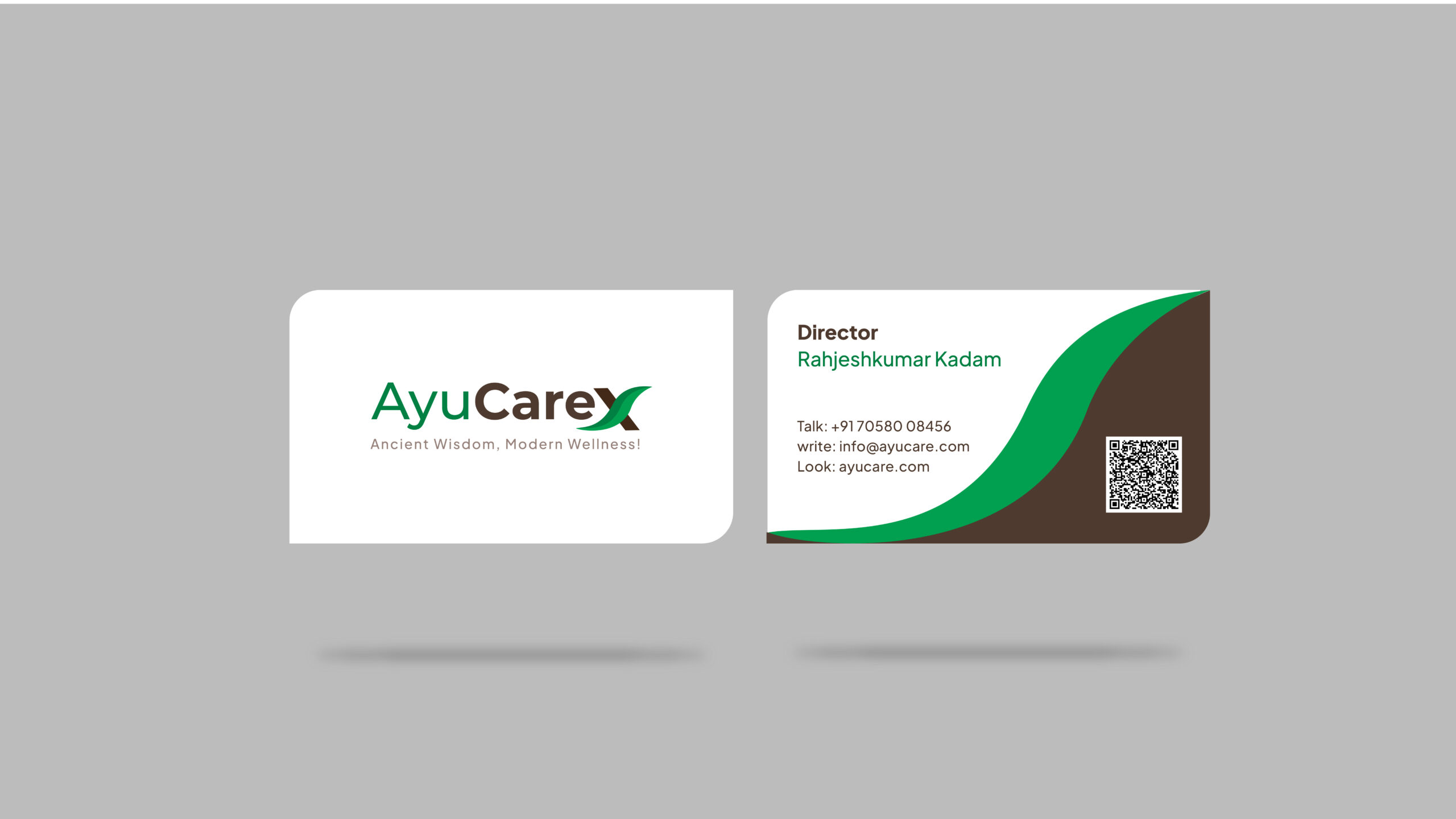
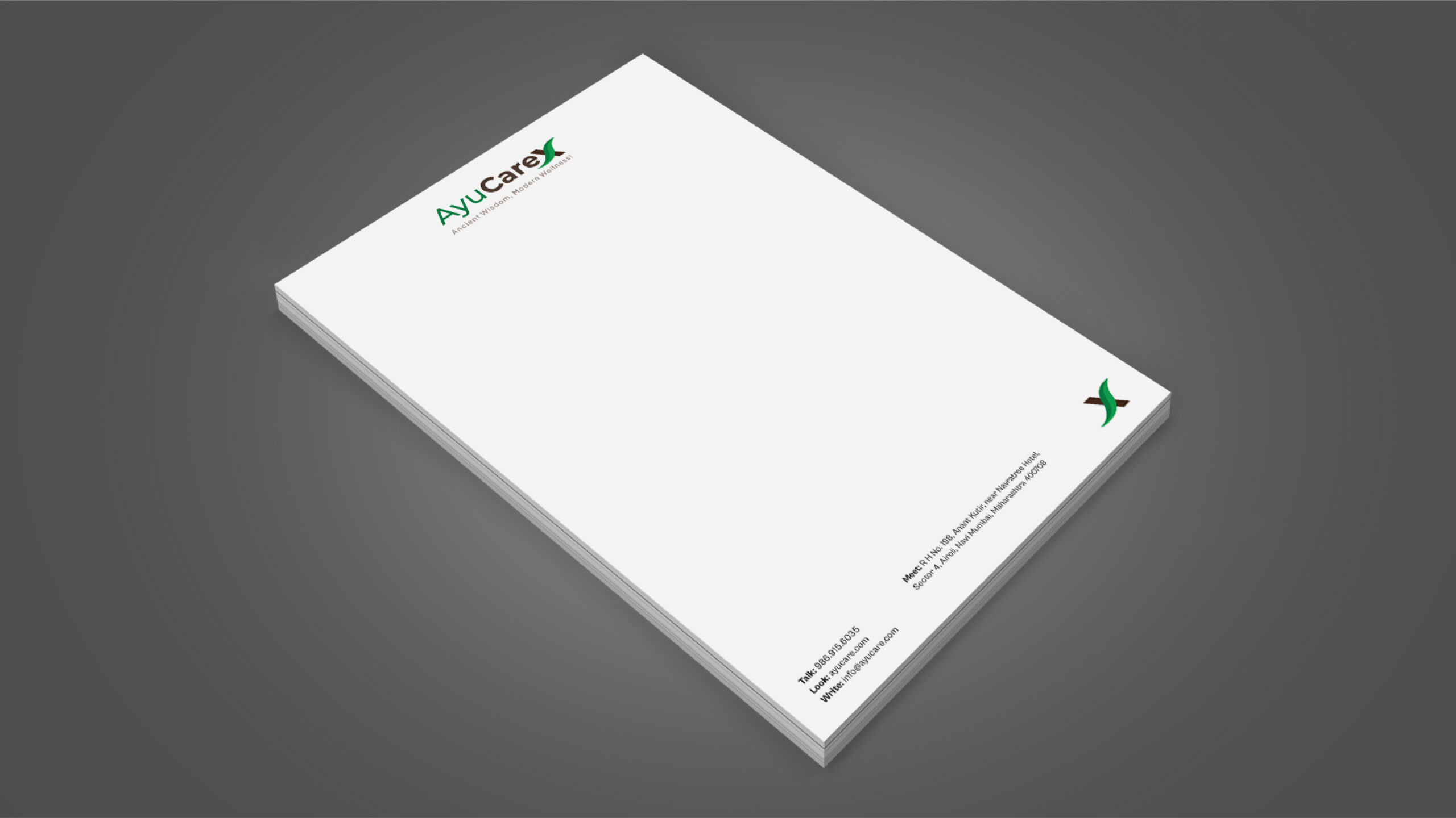
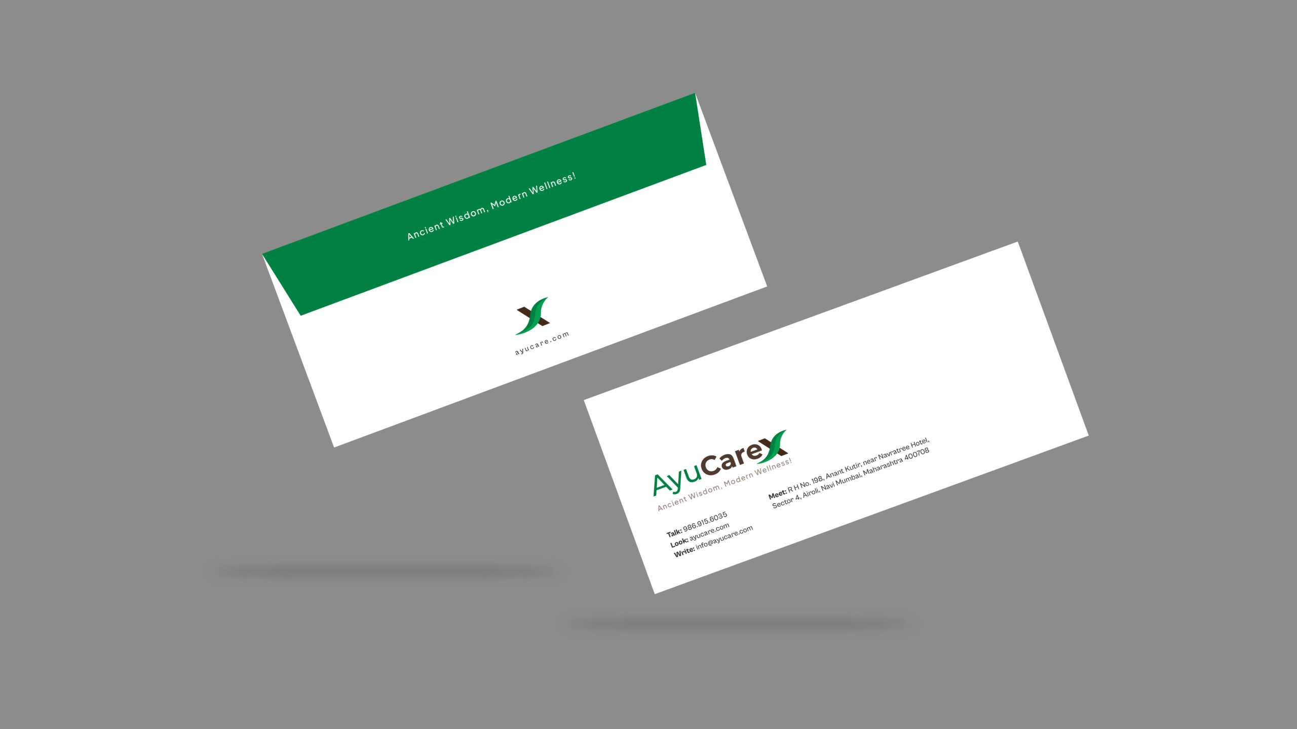
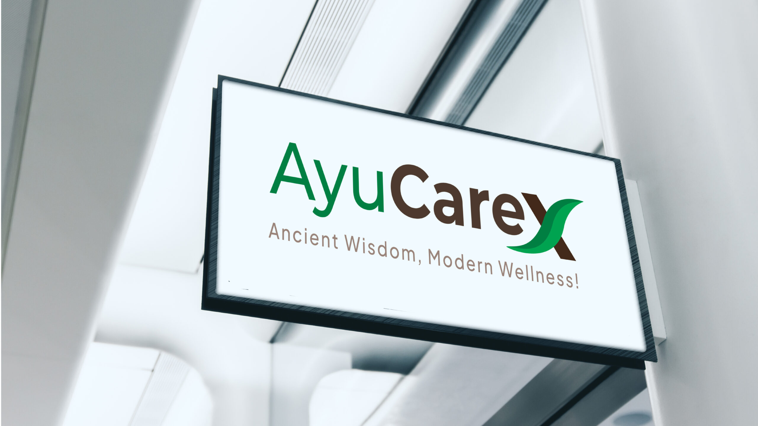
- The ‘X’ in the logo is stylized as a green leaf, subtly reinforcing the
Ayurvedic and natural foundation of the brand. This turned the X—which often feels clinical—into a symbol of growth, rejuvenation, and nature’s power. - The typography was chosen to reflect clarity, elegance, and trust. It’s modern, but not aggressive—balancing clinical reliability with the warmth of care.
- The color palette is rooted in earthy greens and herbal tones, communicating purity, healing, and vitality.
- The tagline and packaging content emphasized the brand’s philosophy:
“Modern Challenges, Ancient Solutions.
This positioned AyuCareX as a compassionate ally for those navigating the stresses of life, intimacy, and health.
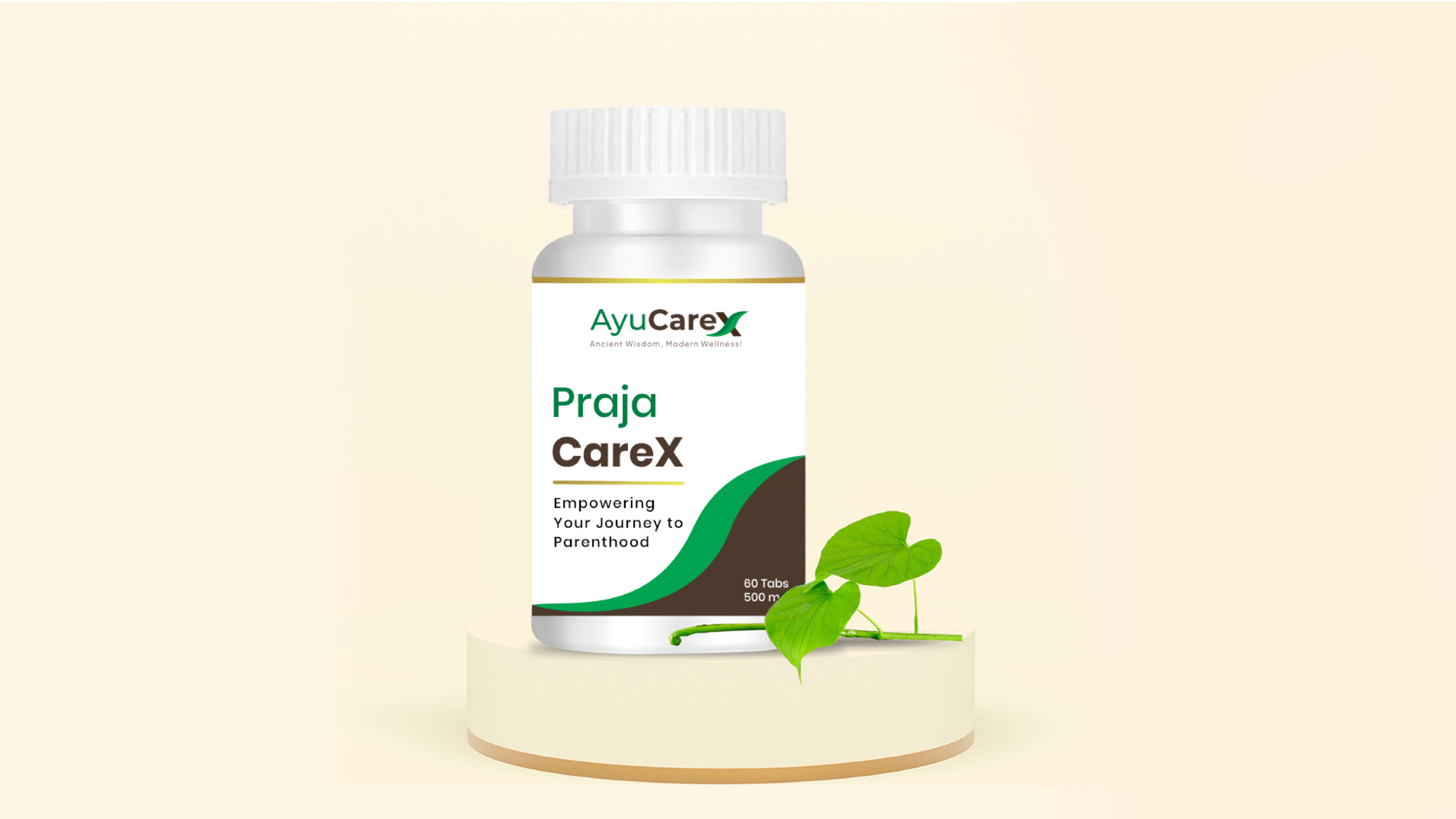
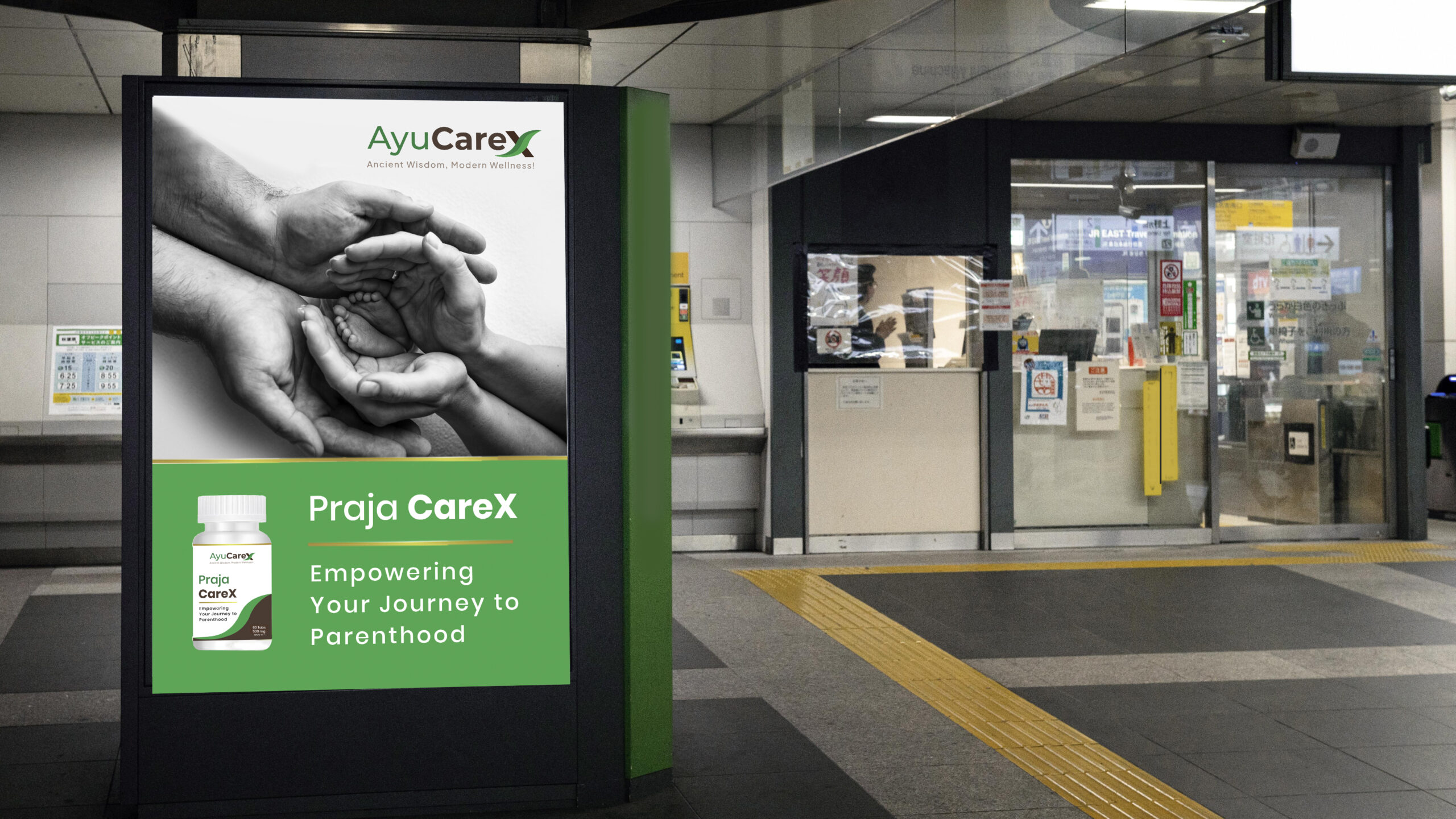
Each visual element—down to the smallest UI icon or label detail—was designed to reassure, not intimidate.
Outcome
The client instantly connected with the brand’s visual and emotional narrative. The leaf-X logo was especially appreciated for how it merged science with soul, and modernity with nature. The design system helped AyuCareX confidently enter a market space that is often crowded with either overtly clinical or overly spiritual brands.
Now, AyuCareX stands as a trusted, aesthetic, and emotionally intelligent Ayurvedic brand—one that empowers people to face personal health issues with dignity, grace, and the timeless power of Ayurveda.